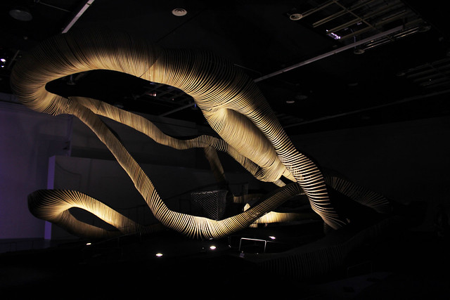
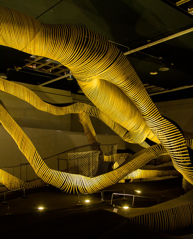
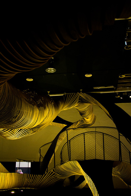
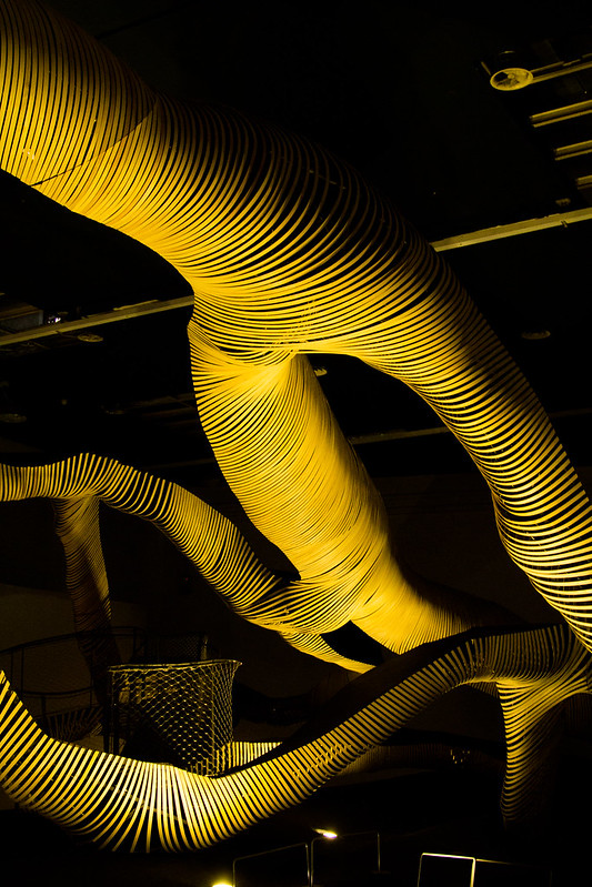
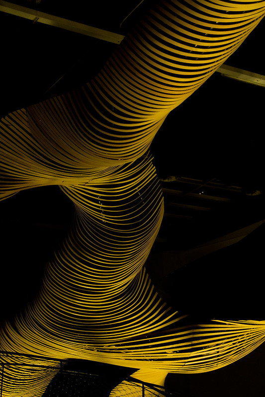
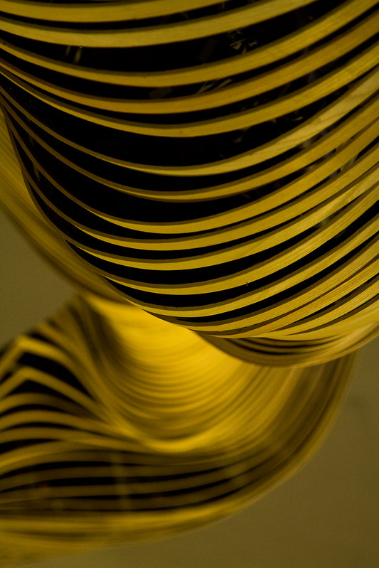
A video from Lexus on "Amazing Flow":
To contribute your Flickr images for consideration, just:
:: Join and add photos to the archidose pool, and/or
:: Tag your photos archidose
:: Join and add photos to the archidose pool, and/or
:: Tag your photos archidose

:: Join and add photos to the archidose pool, and/or
:: Tag your photos archidose
In pursuit of making rail the “mode of choice”, H3 Hardy Collaboration Architecture asserts that several inextricably linked interventions must be made to improve the City’s essential systems and better express its culture: Public Space, Entertainment, and the Environment; Transportation; Education; and Economic Development. A relocation of Madison Square Garden to a 16-acre site on the west side waterfront provides an enhanced venue with a singular new identity and expanded tourist, hospitality, and entertainment opportunities. The New Penn Station, including an eight-track high-speed rail expansion to the south, accommodates increased capacity and integrates community and traveler amenities, including a new three-acre public park, retail complex, and two-acre roof garden. Redevelopment of the Farley Post Office creates a centrally located Center for Education. And, perhaps most importantly, 24 million square feet of private development around Penn Station and up Seventh Avenue serves as an economic engine for improvements and a revived world-class commercial district.
SOM proposes to grow the footprint of Penn Station by two additional blocks to accommodate high speed rail lines for the Northeast Corridor, expanded commuter rail service for all of the tri-state area, and direct rail connections to JFK, LGA, and EWR. This last connection would allow one to go straight from the curb of 7th Avenue , through security at Penn, onto a train, and directly to one’s gate. The station itself is open and intuitive. A central, transparent Ticketing Hall is placed at the center of the site, with dedicated vehicular drop-off and radial, pedestrian connections to the city surrounding it. Below this are two concourses running North-South, seamlessly enabling passengers to move from ground level to below grade. Retail lines these circulation spaces, integrating the station into the surrounding streetscape. Finally, at the lowest levels are the expanded platforms, where visitors arriving from an overnight flight from Hong Kong rub elbows with a commuter on her way to Morristown . With all of these networks intersecting at Penn Station, its central hall would become the iconic gateway for nearly every visitor around the world. Around the Station, Midtown West will continue to grow. Private development adjacent to a major transportation node is perfectly sensible – even desirable. That includes MSG, whose natural location would be adjacent to, but not on top of, a transit hub.
Diller Scofidio + Renfro with Josh Sirefman offers Penn Station 3.0, which will be a city within a city, a porous and light-filled civic structure filled with diverse new programs that reflect the hybridity of contemporary urban life. Not just a gateway to New York , the station will be a destination in itself with fast, transit-oriented programs layered with slower destinations in a gradient of decelerating speeds from tracks to roof. The building will host transient and resident populations including commuters, office workers, fabricators, shoppers, foodies, culture seekers and urban explorers. In this plan, MSG will be located to the west end of the Farley building on Ninth Avenue , with access to Eighth Avenue.
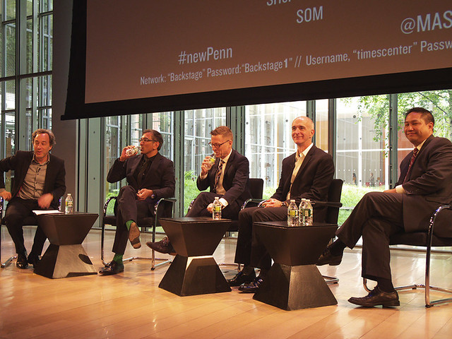
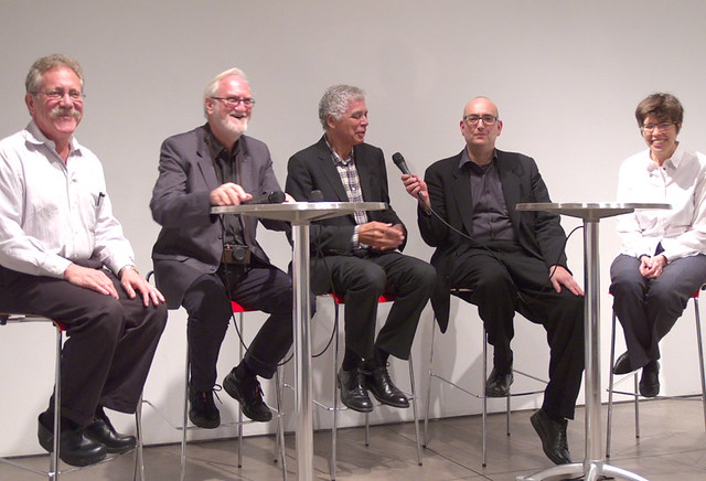
SHoP Architects’ plan imagines an expanded main hall of Penn Station as a bright, airy and easily navigable space that defines a center of a new destination district, Gotham Gateway. In addition to striking public architecture, the project proposes significant security and rail capacity improvements that address major needs at the existing station. The team proposes new development, as well as new parks and amenities, around the station to help defray the required public investment, including an extension of the High Line that connects the new station to a glorious and financeable new Madison Square Garden.Kimmelman and representatives from the four architects in conversation after the presentations:
“It’s curious to see that there are so many ideas on how to tear down a privately owned building that is a thriving New York icon, supports thousands of jobs, and is currently completing a $1 billion transformation. These pie-in-the-sky drawings completely ignore the fact that no viable plans or funding to rebuild Penn Station and relocate MSG actually exist. Not that long ago, MSG spent millions of dollars and three years exploring a move to the Farley building as part of the new vision for Moynihan Station. That plan collapsed for a number of reasons that did not involve MSG, but did involve many of the same people now pressuring MSG to move, including the Municipal Art Society, which created enormous obstacles to achieving the relocation. The restoration of Moynihan Station has been a 20-year discussion that has led to very little progress or funding. The fact that this exercise does not include anyone who actually has detailed knowledge of this issue or understands the realities of this complex project exposes this exercise for exactly what it is.”


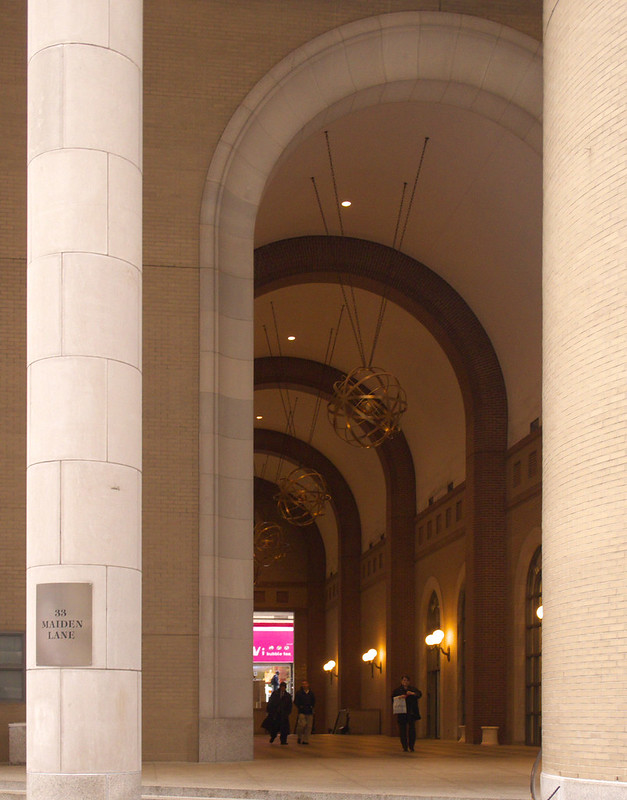
:: Join and add photos to the archidose pool, and/or
:: Tag your photos archidose
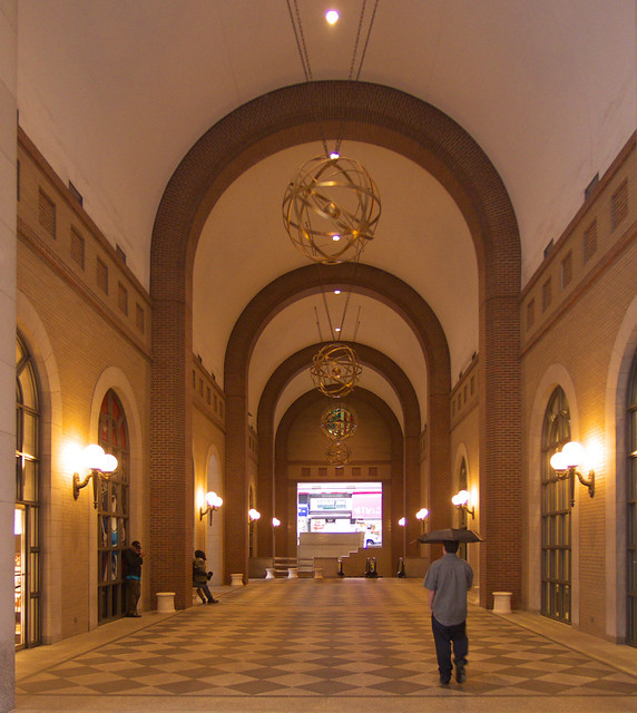


:: Join and add photos to the archidose pool, and/or
:: Tag your photos archidose


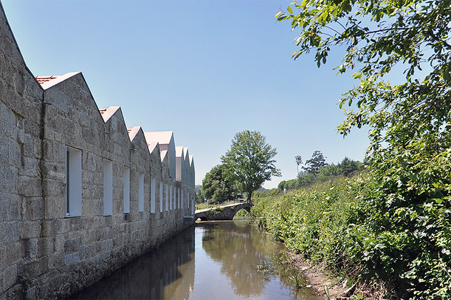
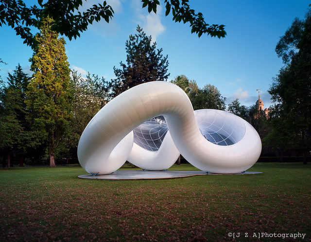
 CA:
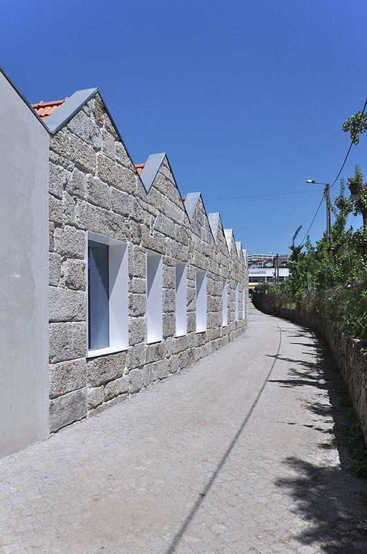
CA: 
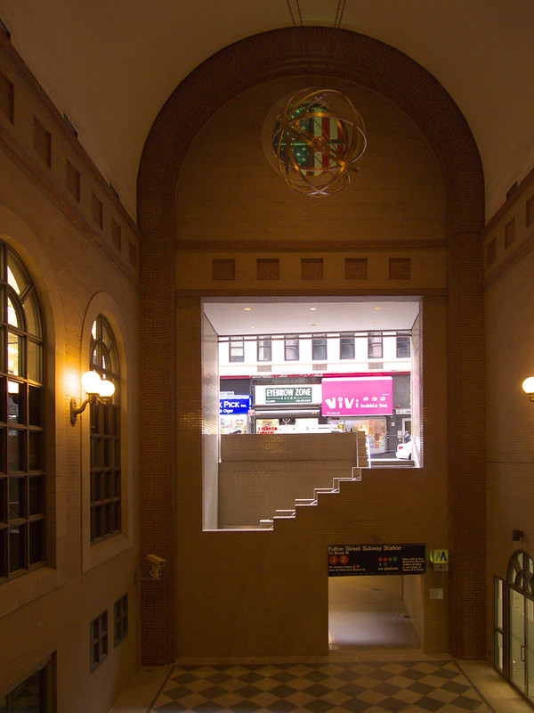
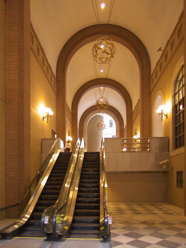
:: Join and add photos to the archidose pool, and/or
:: Tag your photos archidose